Sunday, 28 February 2016

Product: Film Poster


This is my film poster for Forget Me Not. In this blog post I am going to explain my step by step process of making the film poster and why I made certain designs on the style, colour and design of my poster.

I decided I wanted a bold font so that it stood out, I tried out many fonts from "fontspace" and decided that this one suited the poster the best. I used a tool on photoshop to match the colour to a forget me not petal (flower). I also decided to use the same font and colours for the tagline and release title.

I wanted the photograph on the poster to look like the head was falling apart, to infer the characters mental illness (Dementia). In order to achieve this I used YouTube to find a Photoshop tutorial (https://www.youtube.com/watch?v=QnpDy8zlmv8) I used this to create the desired effect.
This effect is supposed to show her memories fading as then it becomes an effective poster as it makes links to the plot of the film and entices the audience.

I took the photo of Chrissy my main protagonist in the dark room and used 2 soft lights. I then loaded my photos to photoshop and decided to choose the one featured, mainly because i liked her expression it made the poster more exiting and her hand rubbing her head was effective. I then used Photoshop to edit out the initial white back ground and remaster it with a hall way from a hospital. I used the histograms on Photoshop to edit both of these photos until they looked as I wished.


Here is the original photo I used in the back ground of my poster, however I changed the levels of it using the histogram tool on Photoshop and made it black and white so it didn't detract from the primary image. I combined it with the photo I took below of Chrissy.

Friday, 26 February 2016

Film poster ideas


I found this film poster on the internet and I really liked how it tied in the flowers and thought this could be something I could try when creating my own poster. I like how its simple but the colour hoping of the red flowers really stands out and captures your attention. The font is in keeping with the tone of the poster its simple but sleek and overall is a very effective image.


I was toying around with Photoshop using photos online to try and replicate this style. I changed the background as I have noticed this commonly is done on film posters. I tried to incorporate Forget Me Nots into the title by using a mask layer on Photoshop.


Here i used an actual picture of Chrissy, my main protagonist, I Photoshopped a hospital scene behind her. And a dded the same title that incorporated the forget me nots.

I plan to take photos of Chrissy next week for use in my film magazine and poster.

Below are some more ideas for titles. I like this font used as its slightly cracked, this might show connotations of Chrissys broken mind due to her mental illness.


Wednesday, 24 February 2016

Film Posters

In this post I want to look at how different film posters from different genres of film differ.


Jupiter Ascending

Warner Bros

Jupiter Ascending is a 2015 American–Australian space film written, produced, and directed by Lana and Andy Wachowski. Starring Mila Kunis, Channing Tatum, Sean Bean, Douglas Booth and Eddie Redmayne, the film is centered on Jupiter Jones (Kunis), an ordinary cleaning woman, and Caine Wise (Tatum), an interplanetary warrior who informs Jones that her destiny extends beyond Earth.

In comparison to the poster below we can see that the Jupiter Ascending poster has much more going on in it. For example the colour scheme is bigger as the poster contains many colours in comparison to the Theory of Everything which contains mainly shades of blue. Also the images used in the post above are much more demanding and require you to look at the poster in detail.

I like how in the poster above the symbol of the earth in font of jupiter has been used twice both as the primary image and as a kind of logo to accompany the title.

The film has a star cast of which two are feature in the primary image on the poster (Kunis and Tatum). This helps to attract audience members who are previous fans of these hollywood actors and actresses.
The positioning of the characters suggests to the audience that there will be some kind of love story between the two charters entwined with the space,  action, adventure narrative.

Its important to note that the poster features the fact that the films from the creators of the matrix trilogy. This will draw in audience members who are fans of the matrix films.
The poster also informs the audience of the release date.... Febuary 6th 2015.
The poster also promotes the use of 3D and IMAX technology, all these things that help gain a larger audience for the film increase the revenue the film will make..


The Theory of Everything
Working Title

The Theory of Everything is  2014 British romantic coming of age drama.

This poster is much more simple than the poster above. Its colour scheme is simple and features white and shades of blue. 
The primary image feature the main protagonists played by the amazing british actors and actresses Eddie Redmayne and Felicity Jones. There positioning and composition in the poster suggest a love narrative and also suggest heartache and heart brake! 
The background or secondary image consists of a double exposure of handwritten formulae which suggests the film has a deep intellectual side, this will attract a different audience to the action, space film above. 
This image is double exposed with a shot of cambridge university, the location of which the film is based. Cambridge university is a historical and famous British landmark. Its the second oldest university in the english speaking world and is widely regarded as one of the most influential and prestigious universities. Including this image in the poster is a clever idea as it will draw in audience members with any interest in british history. Also many Americans have a one sided view of Britain and would have heard about these famous places and this may attract them to watch the film as many love the idea of the posh, British university community.

The font used in this poster is very traditional which suits the storyline and narrative of the film. The top of the poster features a quote from the Rex Reed New York Observer., the quote suggests the film is 'masterful'. The poster also mentions the fact that its based on a true story of Jane and Stephen Hawking who ian English theoretical physicist, cosmologist, author and Director of Research at the Centre for Theoretical Cosmology within the University of Cambridge.

Saturday, 20 February 2016

Film posters terminology and features

Below are two posters advertising the same film 'Whiplash', they are different styles which suggests to me that they are being used to attract a different type of target audience. I would assume the first poster is used in a art house cinema or for a more niche target audience whereas I think the second poster is used to attract a more mainstream audience.
The diagrams below show the differences in techniques and design in order to promote a film specifically to their target audience.


Here are some more posters that are both very different in genres, and the diagrams demonstrate how design can be used to appeal to different audiences and get across the theme and feel of the film.


Tuesday, 16 February 2016

Product: Magazine Cover


This is my film magazine front cover, its an independent film magazine named "Vision". I chose this name as its appropriate to films because it infers that the information being discussed is able to be viewed.. hence Vision. I decided to use a posed picture of my actress as if they were on press tour rather than them in character. I think this is more effective for an independent magazine, and in my opinion makes the magazine more interesting and personal. I think this style looks professional and stylish.

I used photoshop to make and edit my magazine cover. Its easy has access to many advanced tools which I wouldn't have on other software. I choose the font on "font space" and then decided my colour scheme. I decided I wanted my poster to look simple but sophisticated so used dull colours that didn't detract from the photograph.
I used histograms to edit the levels on the photograph, and used the magic wand tools to remove the background, and insert a new one (field of Forget Me Nots) I thought this background would be a great feature for the film as it links to the title of the film..

Photoshop allowed me to overlay other mages so as a special feature I decided to include some new releases, and display pictures of whats to come inside the magazine. This technique is often used on magazines to make you buy them.

I included a bar code because when doing my research I noticed it was one of the things always present.

Saturday, 13 February 2016

Film Magazine

After looking at various names and styles of film magazines I have decided to name my magazine VISION, an independent film magazine.
I decided on this name as its appropriate to viewers, it links to film as we all watch film visually. I want the style to be bold and the text to be in capitals so that it stands out when being sold at the shops. I think I will use a bright colour for the text and some duller colours for the background so the more important information stands out. Also my subheadings will be in a similar, if not the same font as the title but in a smaller size so that it doesn't detract from the title..

I really like the style of the independent Sight and Sound magazine, I like the use of the various sketchy hand drawn fonts. I think the different colour schemes will attract different audiences, and
help them differentiate between what the magazines are advertising.


I also quite like the way that the mainstream magazines are designed, I like how the bright bold title stands out and how the protagonist is centred at the front of the magazine. I love how the text is overlaid over the image of Robert Downey JR.

Friday, 12 February 2016

Magazine cover construction

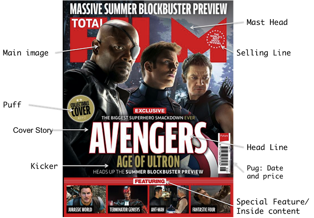
One part of my ancillary task is to create a magazine cover to promote my film that I have shot the trailer for. This is an important part of film marketing, and in order to create a magazine cover I first need to understand how the magazine industry works so I can comply with their codes and conventions.

There are many similarities in film magazine covers, especially those that advertise block buster movies. The photo below demonstrates these similarities...


As you can see bold text is used frequently, and most magazines tend to stick to the same layout. From this montage we can also see that similar colour schemes are used with frequent use of blues and reds. Below I am going to look at the main features of a magazine.


Thursday, 11 February 2016

Film Trailer

Here is my finished film trailer "Forget Me Not", a drama inspired trailer based on a runaway with a degenerative brain disorder, struggling to make a new life for herself.


Wednesday, 10 February 2016

Risk Assessment: How we applied it

Location

Train station: 

  • Wet ground and rain: move with caution to ensure we didn't fall onto the track.
  •  Cold: make sure our actress was warm 
  • In the case that an injury: depending on the severity of the injury we could either take them back to Scarlets house (2 minutes walk) to seek appropriate treatment or take them to hospital in a serious case.

Kitchen: 
  • Hot water: the water wasn't boiled so it couldn't have burned her
  • Aga: warn Chrissy when near it
  • If someone got burnt: run the burn under cold water  
  • Dropping her phone: we used a fake phone so that there was no smashed glass etc. This could be a danger to others.

Bedroom: 
  • On the bed: everyone acted responsibly

Car: 
  • Pushing on any pedals, move the gearstick or the handbrake: warned actors before hand 
  • Using special effects (SFX): we got quite wet so got changed into warm clothes after to ensure we didn't get too cold

Motorway: 
  • Busy road: we were with a friend incase one of us got hurt, in this event we would have called the ambulance.

Street: 
  • Cars and people: we were careful, made sure we weren't in the way of others and always kept an eye out for cars

Hospital: 
  • Not allowed to film patients or staff: we had to be patient when waiting for staff and patients to move out of the shots

Bathroom: 
  • Plastic bottles: e made sure they were all plastic and empty so couldn't hurt anyone or break

Sunday, 7 February 2016

Piano Sequence

While filming we decided to record Chrissy on the piano playing the peter pan theme tune. The idea was that we would incorporate it into "Say" by John Mayer however it didn't sound quite right. We tried many times to blend the two tracks however it just wasn't right. However I really liked the song and the filming so thought I should still include it on my blog. We filmed from two different angles however I have only included one in this video as the other is not essential and was only for use in the trailer to make it more interesting.


Friday, 5 February 2016

Filming Day Five

Today I filmed our final shots of the motorway. I wanted to film this as a time lapse however I didn't have the correct equipment or time to set up the camera for a whole day. Instead I decided to film for a few minutes, messing around with focus and then speed up the footage when it comes to editing it.
I thought the M4 would be an appropriate place to film as its very busy and has enough lanes. I found the bridge I wanted to film from using google maps, I went to the bridge and set up my tripod. I had to ensure the camera stayed very still in order for the shot to work. Here is a photo below of the shot I took.